GAYLE
BARTON
Sr. User Experience Designer
Sr. Product Designer
Digital Design Manager
MUNICIPAL SECURITIES RULEMAKING BOARD (MSRB)
Municipal Securities Rulemaking Board (MSRB) is a U.S. regulatory organization that creates rules for the municipal securities market. Its main responsibility is to protect investors, issuers, and the public interest by ensuring the fairness, transparency, and efficiency of the market for municipal bonds and other securities issued by states, cities, and other public entities.
The MSRB sets standards for brokers, dealers, and municipal advisors, ensuring that they act fairly and comply with established rules when dealing with municipal securities. Additionally, the MSRB provides information about municipal securities through its Electronic Municipal Market Access (EMMA) system, which helps investors and others access data on municipal bonds.
THE PROBLEM
-
Outdated UI design.
-
Backend transformation was needed to modernize.
-
Navigation architecture was none existent.
USER RESEARCH REVEALED -
Users were relying on the search instead of navigation
-
Users were not utilizing all the tools or did not know they existed.
THE TEAM
A mix of Accenture consulting and the Client side product team.
Which consists of:
-
Client-side product owner
-
Director of MSRB-EMMA
-
Subject-matter experts on MSRB-EMMA
-
Accenture product manager
-
2 Accenture UX designers
-
Client-side designer
MY RESPONSIBILITIES
I was brought on as a design leader to take ownership of the UI design for the transformation project. I led daily standups and bi-weekly design reviews, ensuring clear communication and alignment across the team. I reviewed past UX research to maintain focus on addressing user experience issues, ensuring the designs effectively resolved pain points and improved usability.
DESIGN TOOLS
Figma
UI SKILLS & TECHNIQUES
Matching an existing Design Library
PROJECT MANAGMENT TOOLS
Excel spreadsheet
Jira, design-ops plannng
DESIGN THINKING
Started the non-linear process that contains five phases:
Empathize
The top three activities users perform
Based on user research these tasks support investors, issuers, and market professionals in making informed decisions. They were the key focus areas for both the UX and product teams. These tasks reflect the most critical user needs, emphasizing the importance of intuitive navigation, robust filtering, and accessible data presentation. Addressing these concerns ensures the platform meets professional standards our stakeholders demanded and user expectations for ease of use and functionality.
SEARCHING FOR MUNICIPLE SECURITIES
Using filters such as issuer name, state, or CUSIP to locate specific bonds or securities.
VIEWING MARKET DATA
Accessing trade activity, yields, and other financial statistics related to municipal markets.
ACCESSING FINANCIAL DISCLOSURES
Reviewing official statements, continuing disclosures, and other reports for compliance or research.
Old Homepage Desktop Audit

-
Navigation: The layout is cluttered, making it hard to find specific tools and information quickly.
-
Search Functionality: While comprehensive, it could benefit from more intuitive filters and options to refine search results.
-
Accessibility: While it's functional, more focus on accessibility standards like WCAG compliance could improve usability for a wider audience.
-
Mobile Experience: The mobile version was non-existent and defaulted to horizontal scroll, which hindered users accessing information on-the-go.


Define
&
Ideate
RE-STRUCTURED THE USER JOURNEY
From entry
By adding a landing page to the EMMA website improved the user experience by creating a centralized hub for key actions and resources.
This well-designed landing page:
-
Improve Navigation by clearly outlining primary tasks like searching for issuers, viewing trade activity, or accessing educational tools.
-
Highlight Key Features that direct the users to the most relevant sections based on their needs.
-
Offer a simplified layout for new and returning users to quickly find information.
-
Provide introductory content or quick links tailored to common user intents.
Define
&
Ideate
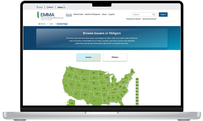
From Finding an Issuer Using the Map or List View:


This approach provides a more visual and organized way of searching, enhancing user accessibility and engagement.
-
From the EMMA homepage or navigation menu, the user selects the map or list view to search for issuers by geographic location or categorized listings.
-
Explore Options: In the map view, users zoom in on a region to see issuers within specific states or areas. In the list view, they browse issuers alphabetically or by other predefined categories.
-
Select an Issuer: After identifying the issuer of interest, users click to view detailed information like disclosures, trade activity, and financial reports.
Empathize
Insights from the Subject Matter Experts (SMEs)
-
Using a geographic relevance investors wanted to identify municipal securities from specific regions for tax or economic reasons.
-
These professionals preferred to browse by location or name rather than inputting specific data, especially if they have did not have the CUSIP number.
-
Most of them where going to this website for educational purposes such as learning about municipal bonds and they found the visual organization of issuers helpful for the exploration.
Ideate
From Home Page to Finding an Issuer Using the Issuers Map

Ideate
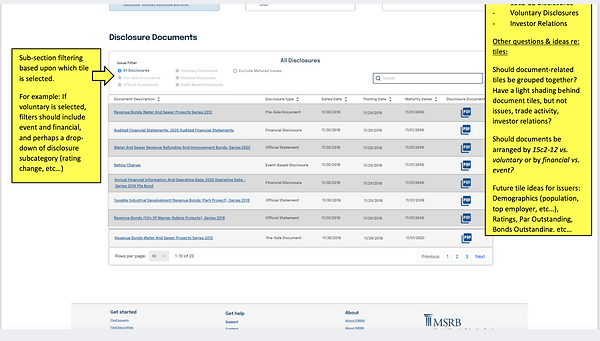
Table Components was the most complicated component
The table components are a central component on the EMMA web site. Used to present detailed financial data, such as trade activities, disclosures, and issuer information. While they are functional and data-rich, users might find the layout dense and challenging to scan quickly. I identified key areas for UX improvement, focusing on enhancing sorting and filtering features, improving the visual hierarchy for clearer navigation, and optimizing responsiveness for mobile users.
Actively Traded Securities table
Old table

New table

When the user clicks the bar chart icon this modal appears
Old modal

New modal

New table in responsive layouts

State additional/voluntary disclosures table with drop downs

Issuer Disclosure Document table

Example when there was feedback from the SMEs delivered in a Word Document
CHALLENGE
Designing the table filtering options for EMMA without user testing was challenging because it relied on feedback from SMEs rather than direct user insights. This made it difficult to ensure usability, as expert opinions focused more on domain knowledge than on end-user behavior. The process involved multiple iterations to balance the experts' expectations with potential user needs in the context of complex financial data.

Example of one of the design reviews where there was feedback from the SMEs

Example of task delegation and story pointing planning for 113 screens and tracking 4 levels of design iterations during design reviews by the SMEs and Product team.
How did I advocate for User-Centered Design when I was involved multiple iterations?
I kept these key points in mind.
Highlighting the Inconsistencies
Pointed out that filters were inconsistently placed, such as dropdown menus for issuer search appearing in different sections depending on the dataset. Proposed a unified placement to enhance predictability.
Improving Data Scannability:
Suggested consistent column widths and alignment for fields like "Issuer Name" and "Bond Type," making it easier for users to scan large datasets.
Explained Cognitive Load:
Demonstrated how varied sorting behaviors for tables, such as for "Market Trends" vs. "Recent Trades," disrupted user flow, advocating for uniform sorting mechanisms
Leveraged the SMEs Knowledge:
Leveraged insights from SMEs on user priorities to refine table layouts for efficient access to key information while making design decisions independently, as their feedback didn’t align with UX best practices.
Communication and Persuasion:
I presented my ideas confidently and effectively to influence the subject matter experts which then reduced friction and gave way for the director to give the final approval.
Results
So what happened?
At the conclusion of our three-month engagement with the MSRB-EMMA team, we delivered 113 wireframe designs, complete with detailed development specifications and documentation. We also provided explanations for the four iterations of a single screen, highlighting the SMEs’ rationale for design changes that diverged from UX recommendations.
These challenges were beyond the scope of what Accenture and the design team were responsible for. Within the given time constraints, we achieved everything possible, despite navigating the highly detailed and often micromanaged feedback from the SMEs and product team.
Reasons
There could be several reasons why the MSRB-EMMA website has not yet implemented new designs, even after they have been delivered.
-
Technical Constraints:
Implementing new designs may require significant backend changes, especially for a data-heavy platform like MSRB-EMMA. These changes can take time due to legacy systems, technical debt, or resource limitations. -
Budget or Resource Allocation:
Updating a platform often requires investment in developer hours, QA testing, and deployment. If resources are allocated to higher-priority projects, the implementation could be delayed. -
Regulatory or Compliance Reviews:
As a financial regulator, the MSRB must comply with stringent regulations. Any updates to their platform may need thorough reviews to ensure compliance with industry standards and legal requirements. -
Without User Testing.
Usability issues might only surface during the later phases, potentially requiring additional iterations or refinements before the new design can be implemented. -
Change Management and Risk Mitigation:
For platforms serving critical user groups, MSRB-EMMA may adopt a cautious approach to updates, prioritizing a phased rollout to minimize potential disruptions. -
Stakeholder Alignment:
Delays can also result from challenges in securing alignment among stakeholders or decision-makers, especially when balancing user needs, business goals, and regulatory constraints