GAYLE
BARTON
Sr. User Experience Designer
Sr. Product Designer
Digital Design Manager
MOBILE APPS
MOVV APP
Movv is a video ecommerce application. Brain child of Chris Alston who also received a Patent for this proprietary video technology.
A VIDEO YARD SALE.
Sure, you can always have a yard sale, if you have a yard. Or use Craigslist, if you want someone local to pick up your old bike, but are you selling something broken?. There's also eBay, if you have a unique or big ticket item that could benefit from an auction-based selling style. But, that's time consuming. What if there is a way to video your treasures and sell it for a better price?. The UX research told us people are more honest, agreeable, and willing to do deals when they see it on video. Without requiring a bunch of effort the seller can use the video option on their cell phone.
THE BENEFIT OF VIDEO SALES
Video makes people’s ears perk up. Almost all of us feel compelled to click a play button when we see it, and that gives you the power to compel people to watch your video, even when they wouldn’t read what you wrote. This app takes pays attention to the reuse, repurposed and upcycled, eco-conscious millennials. They know upcycling saves you money and allows products to be used to their fullest extent.
DESIGN TOOLS
Adobe Illustrator
PROJECT MANAGMENT TOOLS
Google Drive
UX TECHNIQUES
Gorilla testing
AB Testing
User Journey
Use Cases
MY ROLE
As a UI Mobile Designer and Digital Designer (Freelance), I designed the look and feel for the MOV mobile app and provided delivery of assets to the development team. Presented updates and proposed designs to Chris; as a stakeholder and the visionary of this project his opinion was final but we surprisingly worked well together. We worked collaboratively and shared files using Google Drive.
USER JOURNEYS & USE CASES
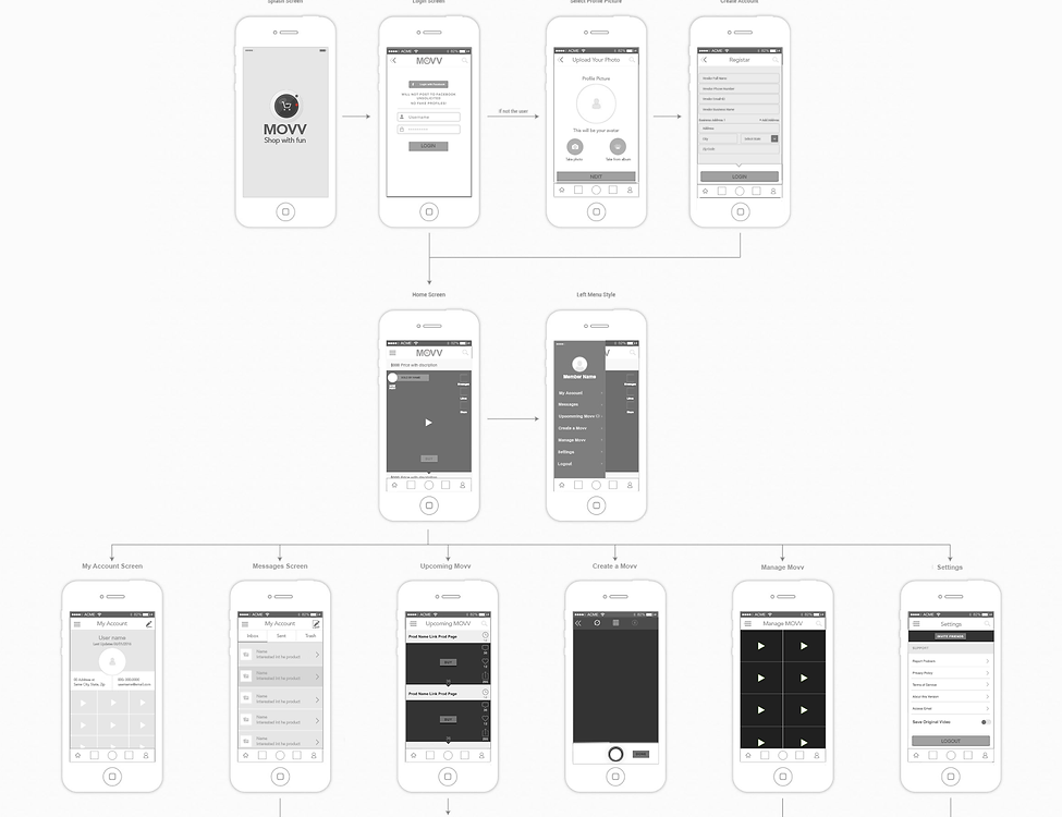
Mapped out the user journey and wire framed a low-fi experience. Chris and I walked through the user journey and found user bottlenecks during our collaboration sessions. I made changes iteratively and updated wireframes immediately. When we got the wireframes to a comfortable place, I helped Chris facilitate user testing on those wireframes. We came back with findings, I re-worked the user flow and made changes to the wireframe acoordingly.
DESIGN STRATEGY & LANGUAGE & BRANDING VISION
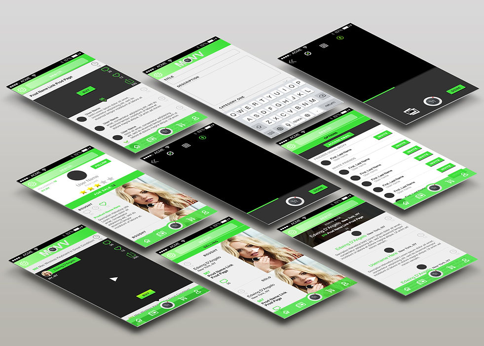
The name Movv means “Move with Video.” Chris wanted a name that reads as classy but also evokes feelings of a fun, authentic, social and safe. I developed a strategic partnership with chris to help him find the 'voice' of the brand and to communicate the vision of his startup. I did many iterations of logo designs including icons, but I decided it best to stick to a text-based logo that reads as tech-forward and professional. I chose a color scheme of bright green to emphasize the eco-concious ideology that is based on the belief that the convergence of technological change and social innovation provides the most successful path to sustainable development. The green had a futuristic, positive, innovative feel, while the cool blacks keep the logo grounded, balanced, and professional. The mobile app needed to be clear and easy to use and added to the social from anywhere you can share, like or post your favorite product.
PACKAGED ASSETS & DELIVERY
Coordinated with Chris to design all the marketing material need for a startup. Provided all assets for print and for development for iOS and Android.
WIRE FRAMES

PROTOTYPE

BRANDING

RESULTS
As my contract with Movv was ending, the development was going to be continued in the Ukraine, Russa. I delivered files that included a user story document, a style guide document, a working Photoshop layered file, properly saved SVG files for Android Studio and PDFs at 1x and 2x for Apple. Overall, this project was a great experience regarding the benefits of wireframing the user flow from the beginning and that drove extensive refinement all the way to final delivery. Going forward and learning from this experience, I will take the same editing eye to future projects and continue to refine my designs based on detailed user research. I'm very thankful for the time I was able to spend working with Chris, he has an infectious passion for this progect and as it was an incredible experience.
TIMEKICK APP
The TimeKick app allows users to customize their phone’s alarm by integrating with Siri to hear the time and a countdown in increments they choose. A challenge as the UI designer was working remotely with a client and developer I’d never met in person.
CHALLENGE
The app name was changed from "What Time is it?" to "TimeKick".
GOALS
I worked with the client to determine the goals, scope and constraints of TimeKick, as well as how to market the product. I used PowerPoint to share mockups and collaborate with the client to refine the design.
PROTOTYPES & BRANDING VISION
For efficiency, I designed the logo and the UI at the same time and shared prototypes with my client to narrow down UI approaches to time selection, then created high-fidelity wireframes. At that point, I wireframed the entire flow of the app in several screens.
PRODUCTION & DEVELOPMENT
After each screen for the app was designed, I created mobile assets for all iOS retina and non-retina screens. I also included screens for error states, settings and information dropdown. The engineer and I communicated via Skype and email to nail down development and production.
FINAL THOUGHT
This project challenged me to effectively translate my long-distance client’s conceptual ideas into mockups using tools such as PowerPoint. My client loves the app -- and I loved designing a product from the ground up.
DESIGN TOOLS
Adobe Illustrator
PROJECT MANAGMENT TOOLS
Google Drive
UX TECHNIQUES
Gorilla testing
AB Testing
User Flows


